Visa, Digital Commerce App
One app.Any bank.
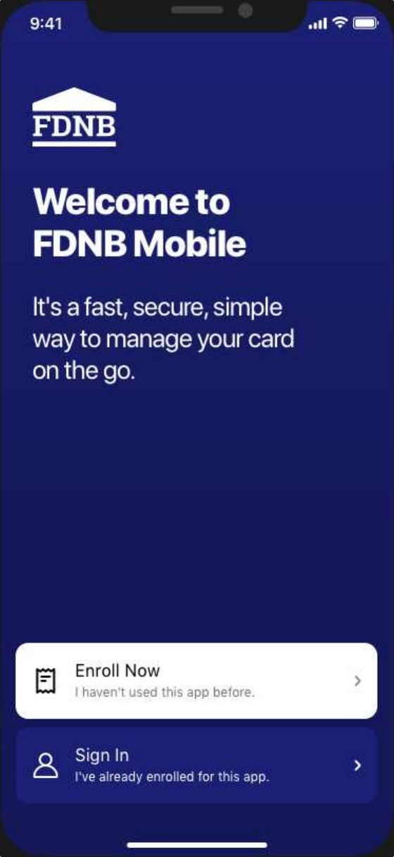
Welcome to FDNB Mobile
It’s a fast, secure, simple way to manage your card on the go.
Client color
- Brand color
- Text on the brand color
- Icons on white
Pick any color. The text and icons follow the rule I wrote from the WCAG contrast formula, so every client’s app passes.
- Role
- Design language and home screen lead
- Clients
- Card-issuing banks, white label
- Platforms
- iOS and Android
- Timeline
- 2019–2021
Overview
- Problem
- Cardholders said the app looked dated, things were hard to find, and they missed features it already had. Client banks were unhappy.
- Opportunity
- It’s one banking app that card-issuing banks give their cardholders, in their own name and color. One redesign lifts every bank at once.
- Solution
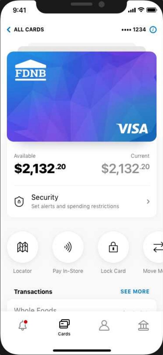
- A new design language, directed with the other designers, and a redesigned home screen built around the card, in each bank’s own color.
The result
A home screen built around the card, in each bank’s own color.
Rules,not exceptions.
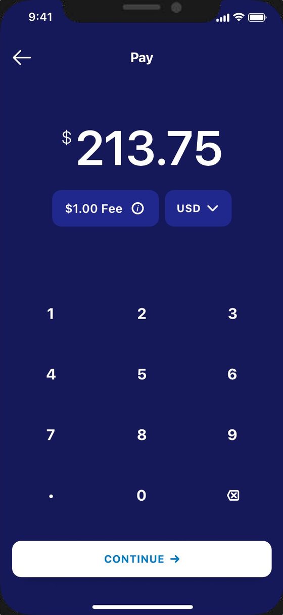
Contrast set by a formula, a home screen that takes any mix of features, native controls wherever they exist. Every client gets its own app from one set of rules.